menu
This week’s post is about viewing your photos – digital and printed.
Where digital photos are concerned, what you see is not always what you get. Sure, the content is the same BUT colours and clarity can vary greatly. Screen resolution and calibration as well as brightness – of the screen and environment – impact what you see on your screen, and the printed version depends, not only on whether the screen you are viewing them on is calibrated but also whether you set up the printing profile correctly AND the lab follows the same process.
In many ways it is a bit of a hit and miss affair.
Say you get all your ducks in a row. You’re going to be OK, right? Well…not necessarily because where you display your photos is also going to make a difference.
The light, quantity and quality, will also impact what you see.
I did a quick check today for a printed product I recently received. I do calibrate my monitor regularly. It’s hooded so that the ambient light in the room has less of an impact on the screen when I’m working and I turn off the tungsten overhead light and usually only edit during the day – filtering out any strong sunlight because those variations will also impact what I’m seeing.
I consider what substrate (type of paper, canvas, wood, metal etc) I’m going to print on and then set up that profile to make sure I get as close on the screen to what it will look like when it’s printed out. You can’t image the variations different substrates will result in, not only in colour but contrast and even sharpness. It’s all got to be considered.
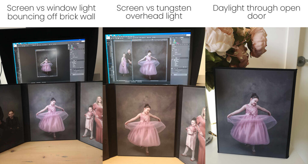
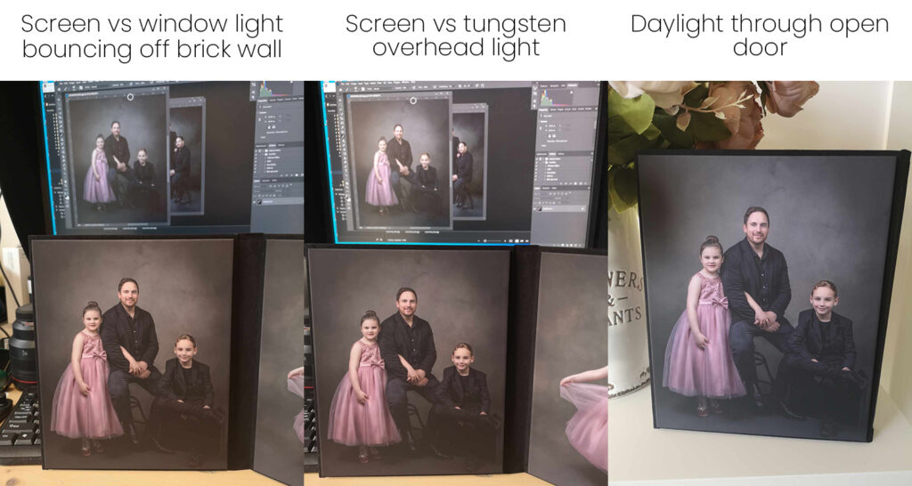
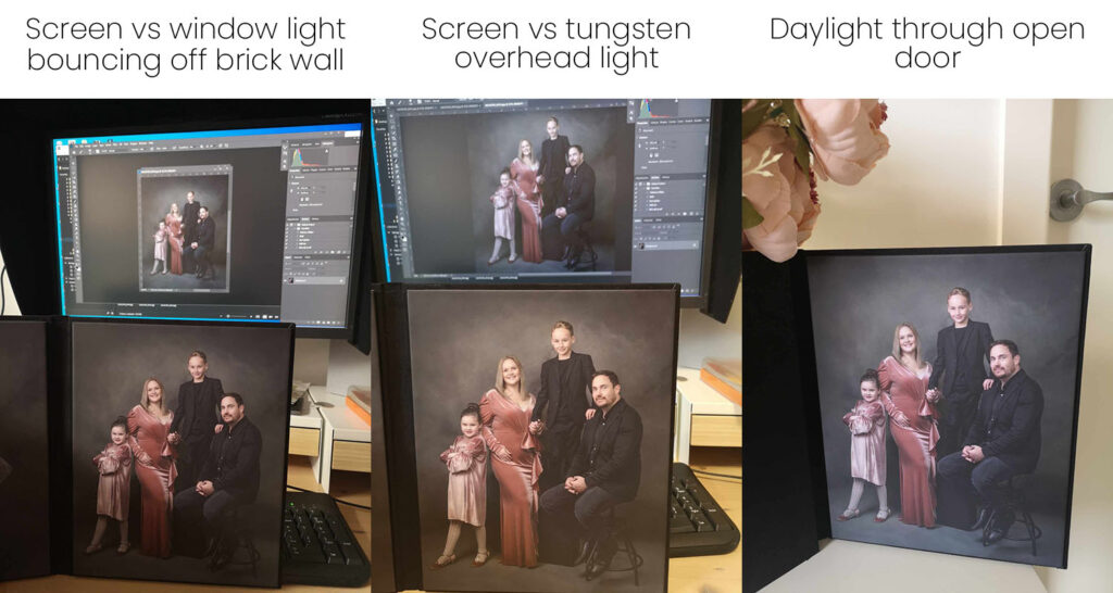
I grabbed my phone and took a few shots today to show you a bit about what I mean in terms of the ambient light.
You can see the screen in the background and then what the printed product looks like;
1. with the window light in my office (it bounces off a pale yellow brick wall and fence so isn’t true daylight in colour),
2. then with the overhead tungsten light on and finally,
3. next to an open door with lovely soft daylight flooding in.
The difference is obvious and, as I always edit for soft daylight, the results are pretty close to what I was aiming for.
Point of this, always consider where you are going to display your finished pieces for best effect. Always use daylight bulbs indoors if you have artwork or photos displayed.
OK, so I didn’t keep up with the blog after starting it. I’m going to try and do better. You might also notice a bit of a rebrand.
Cheers
Pam
Be the first to comment